
“We are all different.” seems like a simple, easy to understand statement, right? Each of us is different and, in the OSINT world, we leverage those differences to generate creative methods to investigate our subjects and in processing the data we collect.
Different is good. Embrace it.
And yet, there are times when we forget about these differences. We focus on what we are thinking. What we understand. And how we process data. We may fool ourselves into thinking that “If I can see the similarities or differences in this data, someone else should be able too as well.” This bias can appear in our analyses and our final products. Let me give you an example that you may have seen in others’ OSINT work (or perhaps in your own).
Image Notation and Markup
With image analysis and geolocation skills in high demand, many people are marking up images and showing locations where an event occurred using colored lines and shapes. While I and most of my colleagues can recognize shapes and perceive colors, your report, blog, or intelligence summary may eventually reach someone who cannot. Your work output should be accessible to all its intended recipients, regardless of their ability to see colors or even see at all.
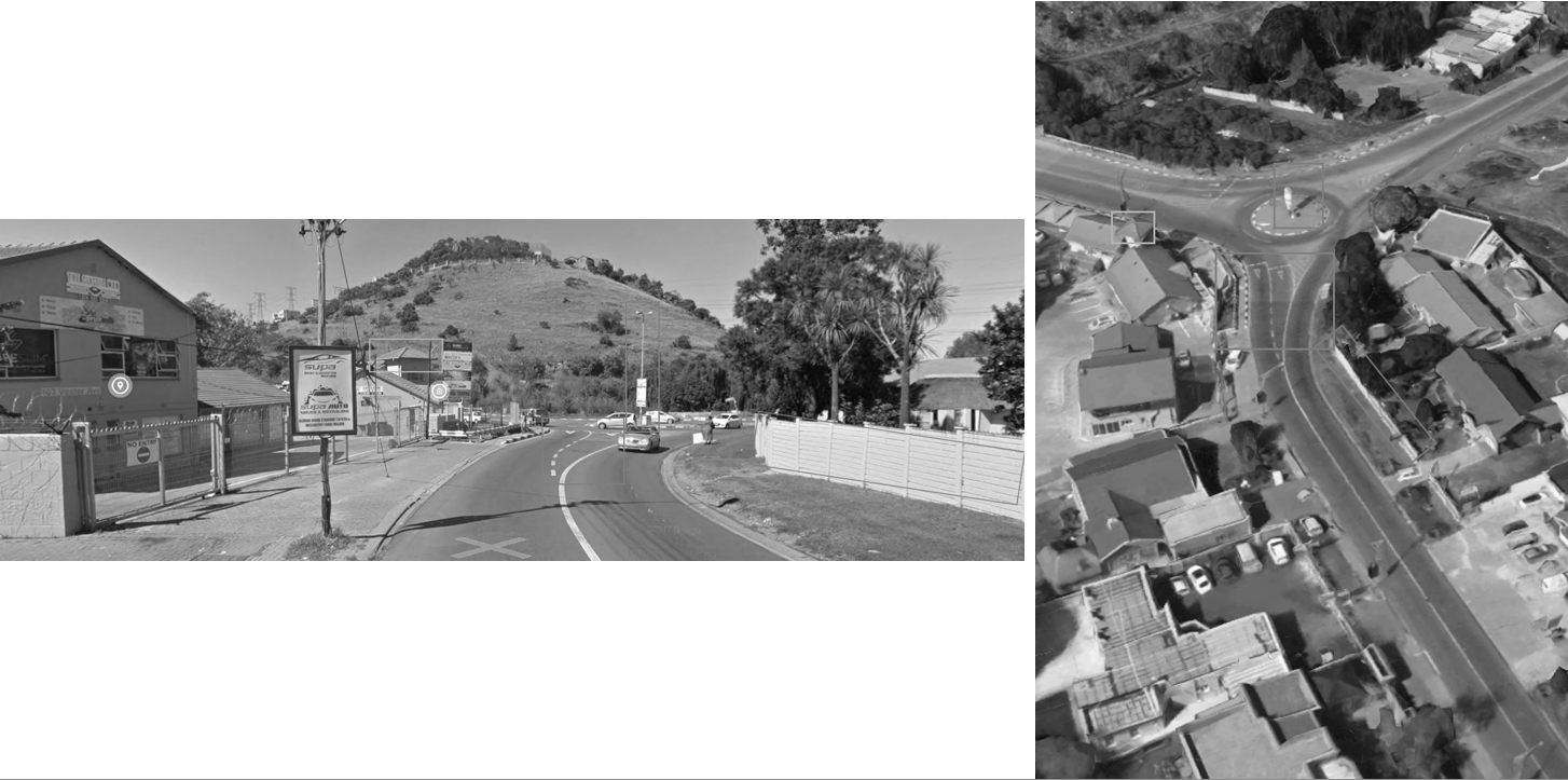
As an example of this, I’ve taken some imagery from Google’s StreetView and satellite maps and marked them up as you might see someone do when they are trying to show that features in one image match the features in the other image.
Using Colored Boxes Alone

For many of us, the above images are easy to interpret with the red box in the left image corresponding to the red box feature in the right image. Continue through the yellow, green, and cyan colors and you have four matching features I have noted.
Take these same marked up images and apply a grayscale filter that simulates what someone with monochromacy, colorblindness where a person perceives no colors, just shades of black and white (1), might see.
Images to be compared with colored boxes denoting similar features with grayscale
The differences are not so apparent now. In fact, finding all the shapes in the left image is almost like playing “Where’s Waldo” (2). I know where I put the boxes, and yet in some places in the images I have trouble spotting them.
There are, of course, additional markup techniques we could use to better highlight these features in the images.
Using Colored Boxes with High Contrast Arrows and Numbers
Let’s take the original images and add black arrows with white shadows and numbers to the images near the colored boxes. This is shown below.
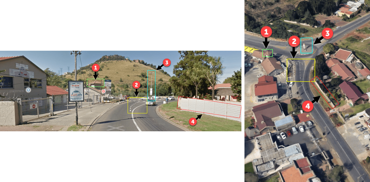
The addition of the arrows and numbers clutter the image a bit more but they also make it more accessible to people with vision impairments. Let me show you. The same image is shown below in grayscale.
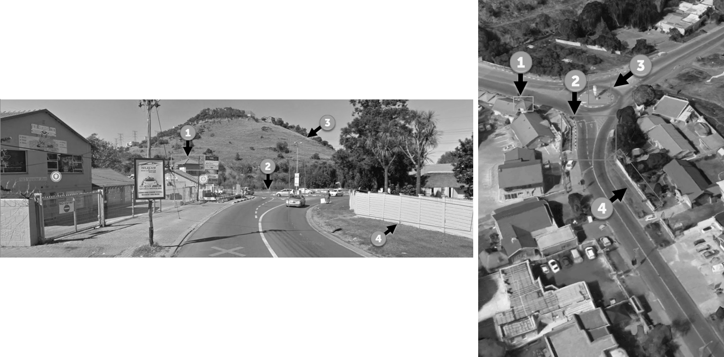
Images with colored boxes, arrows, and numbers denoting similar features with grayscale
The boxes are still incredibly challenging to pick out in the images but the additional components help draw the eyes to those areas the analyst has chosen.
Additionally, adding these numbers make referencing the features in the text of the report much easier. Instead of writing something like “In the cyan-colored rectangular box on the left,…” you can simply state “In the image on the left, arrow #3 points to…”. This is easier to understand for people that do not know what certain shapes or colors are and for people that cannot perceive colors. This technique is a positive step in increasing the accessibility of our reports and blog posts. We all need to take these steps.
In case you are wondering what software I used to make these annotations, I use SnagIt (https://www.techsmith.com/screen-capture.html) and I’m sure there are other software products that do an equally great job of this.
Are There Other Changes We Should Make?
Absolutely. Make sure your colors have high contrast. Add alternative text to your images for screen readers. [Edit: Twitter user @smoofles suggested varying the line qualities by using squiggly, dashed, ziggy, or dotted lines; using outlines-on-lines for better separation from background; using different shapes (like triangles, circles, and squares)]. And there are many more.
But I will be the first to tell you I do not have all the answers here. There are resources for you/us to learn how to make our products more accessible. Below are a few suggested resources.
For web content, take a look at the WCAG (https://www.w3.org/WAI/standards-guidelines/wcag/) documentation.
To check the color contrast of your product’s (report, blog, etc.), try the https://contrast-ratio.com/ tool.
The National Center for Accessible Media (NCAM) organization (https://www.wgbh.org/foundation/what-we-do/ncam) has resources and training available.
Understand and Embrace Our Differences
We are different.
Recognize it.
Embrace it.
And try to ensure that your OSINT products are accessible to your audiences.
Do You Know of Additional Resources?
Post them in the comments of this blog!